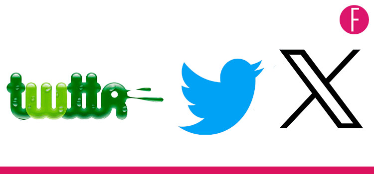
Twitter is now X. But this isn’t the first time the app has been rebranded since its original creation in 2006. Take a look at the multiple faces of the Twitter Logo over the years!
The past couple of days have been rather eerie, the iconic and instantly recognisable blue bird in the world of social media is now being bid adieu. Musk recently went on a twitter rant announcing his plans to drop the blue birdie and rebranding Twitter as X. The official change was instead put into action on Monday marking another major shift since his takeover of the social media platform.
As the tumultuous journey of Twitter verse continues, courtesy Elon Musk, we take a deep dive into the journey of the iconic and not so iconic Twitter logos over the years.
2006:The Journey Begins
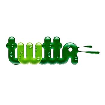
Twitter was originally called “Twttr”, an app meant for sending SMS messages in groups. This name lasted only a few months before the app began the journey to become what it is today. However, it did have a strikingly different logo while it lasted. The slimy green logo aimed to represent nature and freedom, a theme the brand has stuck with through the years. Interestingly enough this logo was never used on a public product. It was mainly just for the creators themselves.
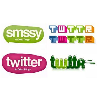
Among this final choice were other more bizarre designs, one even with the original name idea “Smssy”.
2006-2010: Enters The Classic Shade Of Blue
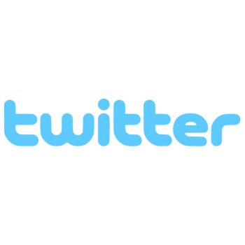
The first public blue logo was designed by Linda Gavin in just one day. It marked the change in theme from green to the now iconic blue tone that we associate with Twitter. The simplistic and minimalist vibe of this logo was meant to represent the simplicity Twitter would imbibe.
2010-2012: Welcoming Larry The Bird
Although the idea of a bird as part of the logo had been thought of since the beginning, it took four years till any final decision was made. The company bought the bird graphic for $15 from Simon Oxley, who redesigned it. It was originally a mascot with eyes, eyebrows, and legs. The design was replaced with a simple silhouette and named “Larry” by co-founder Biz Stone after the NBA player Larry Bird of the Boston Celtics.
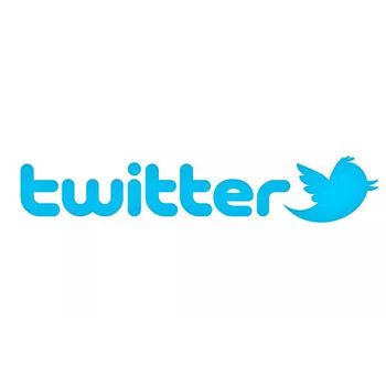
2012-2023: The Bird is ReBorn

In 2012 the brand commissioned Martin Grasser fresh out of Art school to design the iconic blue bird. The design was one of the 24 options presented to CEO Jack Dorsey and according to Grasser, he picked it almost immediately. The artist also claims his dyslexia played a part in the bird’s creation. “I believe my dyslexia gives me a sensitivity to shapes,” he said. “For instance, a lowercase ‘a’ in Helvetica has a certain harmony and balance that can’t be displaced. Shapes can evoke similar feelings, and as a designer, it’s my responsibility to adjust them on a two-dimensional surface until they feel just right—a blend of mathematics and artistic intuition.”
As for the meaning of the design, the bird is looking upwards, symbolising the hope and freedom communication brings.
The Present: The Bird Goes Xtinct

Thanks to Elon Musk’s takeover, the iconic blue bird has been replaced by a white “X” against a black background, further making apparent Musk’s obsession with the letter. Twitter, sorry, X, has reacted to this change in many ways. Grasser, the bluebird creator himself says “The logo had a great 11-year run, and I’m glad to know that it’s a beloved symbol,”. Meanwhile, former CEO Jack Dorsey retweeted Grasser’s thread outlining the creation of the original symbol with the “GOAT” emoji, making his stance clear.
What’s Next? Team FUCHSIA deliberates
Given the new logo change the term “tweet” no longer makes sense, which is why Musk decided “tweets” will now be posted and “retweets” will now be reposts. If the logo wasn’t robotic enough, and now we can’t even “tweet” and will have to make do with a mundane “post” For us, Twitter just lost its main USP, in fact, its mojo? Musk also aims to transform the app into some sort of super app with multiple functions, using the Chinese mega App, WeChat as his inspiration.
“If you’re in China, your kind of live on WeChat, it does everything,” he said. “It’s sort of like Twitter, plus PayPal, plus a whole bunch of other things. And all rolled into one.” What do these changes mean for the future of Twitter? The members of Team FUCHSIA give their two cents: “The process to get there seems complicated, but it would be convenient” “But if we have everything on one app, if it goes down, we’ll lose everything.”
Twitter doesn’t vibe the way it used to anymore, how do you feel about these changes? Excited? Disappointed? Will stop using the App? All of the above? Let us know in comments below.
